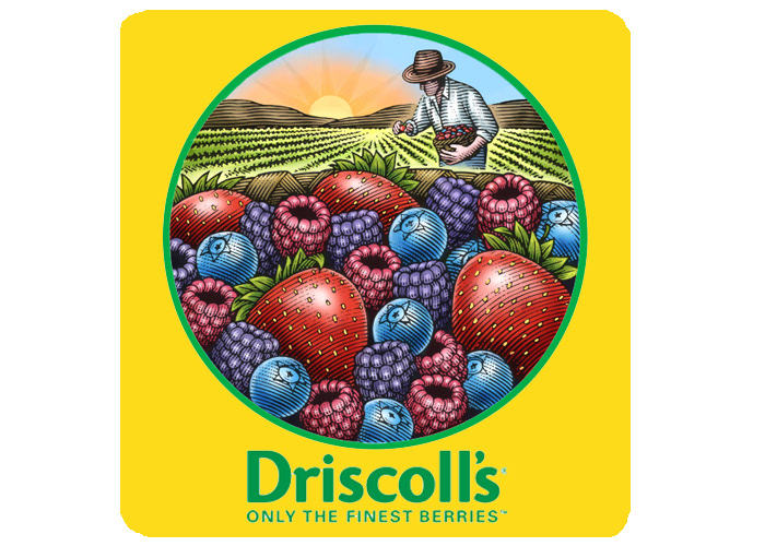
"Helping Driscoll's sell billions & billions of berries... Driscoll’s, the leading provider of fresh berries, brand identity has been incorporated in various brand communications from labels on individual clamshells, to the trays used to ship the clamshells as well as signage at the company’s headquarters. The new brand identity unifies and strengthens the look of Driscoll’s destination Berry Patch displays in retail stores."
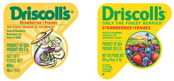
"The company tapped San Francisco-based Michael Osborne Design for the task and commssioned Steven Noble to create the illustration of a farmer in a field of berries and most important, berries overflowing in a basket." The artwork was created in a scratchboard woodcut sty;le with color added digitally. The new logo retains key brand and label design touch points, such as the familiar triangle shaped label, and the vibrant yellow and green background colors, while restructuring messaging in a hierarchical fashion on the labels.
“This is the evolution of this brand,” said Douglas Ronan, VP Marketing at Driscoll’s. “The Driscoll’s brand is one of the most recognized brands in the produce industry. Our heritage is in strawberries. Now, by using all four berries on our package, we are reinforcing our leadership position in fresh berries while highlighting the special efforts of our farmers.”
Logo Identity
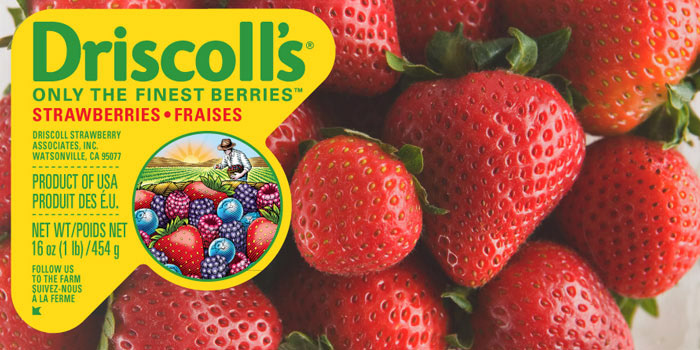
Packaging
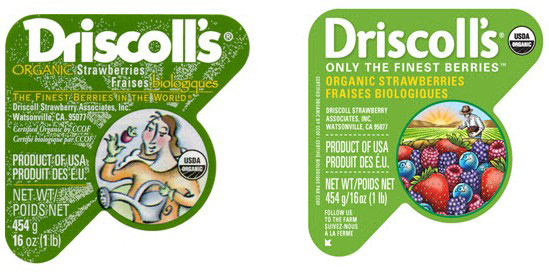
Before & After
Before & After