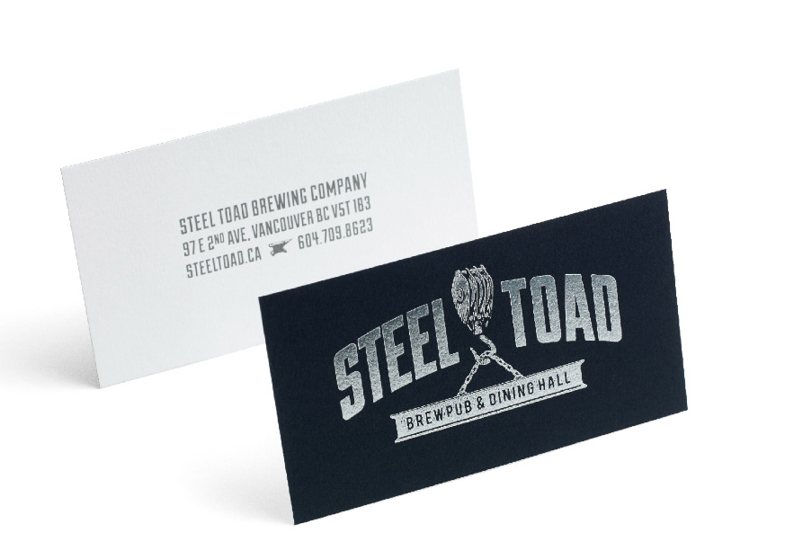
One Twenty three West, commissioned Steven Noble to create a series of small logo illustrations for a brand identity for a brewpub called Steel Toad Brewing Company. The illustrations were created to commemorate Vancouver's industrial past. the complete identity includes logos, signage and packaging that combine for what creative director Jeff Harrison described as “a brand that makes you feel like you’re a steel-pounding, blue-collar worker even if you’re a computer-operating, white-collar dad.”
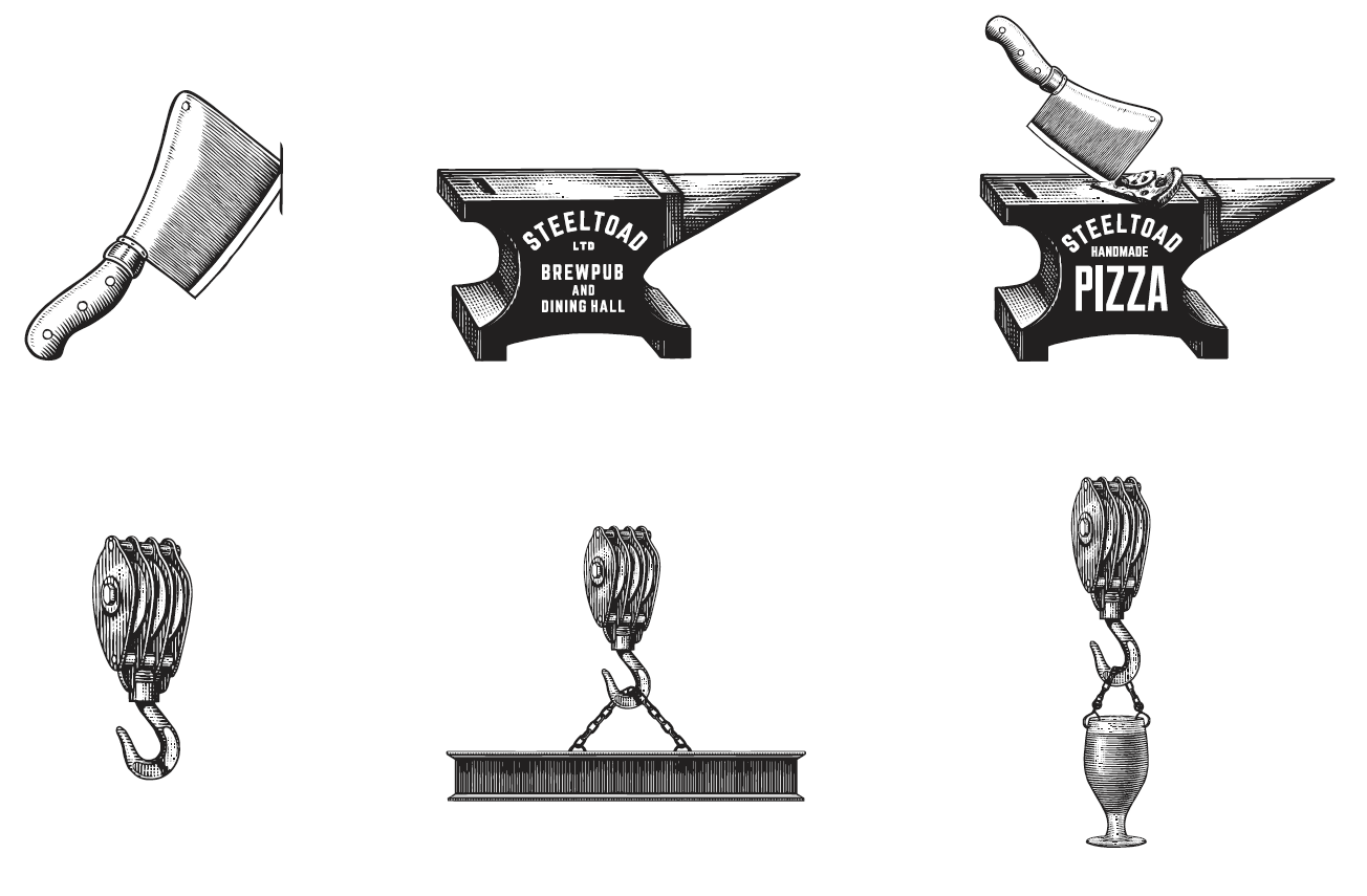
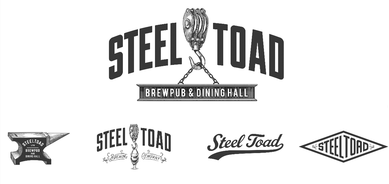
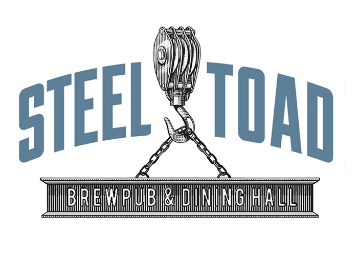
The primary logo, as seen on the company’s business cards, features a block and tackle hoisting an i-beam. It is supported by a series of interchangeable elements, like the cleaver and anvil icons seen below, that mix and match for modified logos for different packages and merchandising efforts, as well as imagery tailored to specific business segments like kitchen staff and events. A range of typefaces were used to reflect the industrial age.
Illustrator Steven Noble contributed to the logo elements. “He’s a great guy to work with and is the only guy who can pull the vintage style off,” Harrison said of Noble’s scratchboard, engraving and woodcut style of line art. After researching the history of Steel Toad’s building, a restored steel foundry over a century old, Harrison found that most of the steel company’s sales materials used a similar aesthetic. “[Noble] seemed like a perfect fit,” he said.